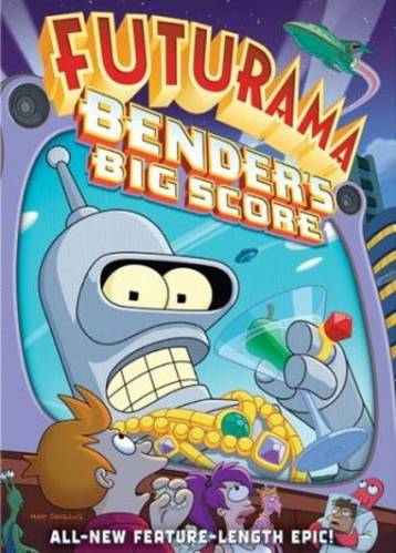
I Liked this image because it's a show that i like, and this design is very aesthetically pleasing to me. the reason i'm directly drawn to this image is because of the bright and highly saturated color scheme of the design. the design doesn't fallow normal design setup as the image is docked to the left side of the ground, and nothing important is centered, or in the natural top right corner. the large face under the text, takes the main focus, and slowly your eyes move from the largley propotioned face to the smaller secondary characters on the bottom of the page. the bottom characters are all in darker and more neutral colors, not taking away from the main character's focus in the design. this makes the rythm smooth and takes you all around the image. all of the proximity is taken up, and the image covers several planes, forground (characters on bottom) middle ground (the giant televison with the face in it) and the background (the text, buildings, and the rocket ship) all of these design principles add for an aestheticaly pleasing design.

No comments:
Post a Comment
Hope you enjoy my work, if you'd like to leave any comments, or suggestions feel free as theyre always welcome.
-thanks!